Jan 2023 - Mar 2023
Christopher Kwan
Hannan Hussain
Tina Lin
Researcher
UX/UI Design
Intern Guys is a SaaS startup company whose product focuses on streamlining the process of finding internships. Unlike job sites like Indeed and Glassdoor, Intern Guys makes it easier for students to locate and secure internships through a centralized platform focused solely on internship opportunities. I joined the company as a UX/UI design intern, focused on improving and redesigning different areas of their product to improve the user experience and flow.
To find areas of improvement, I sought out and interviewed third- and fourth-year university students seeking internships. I performed my interviews in person to better understand how users interacted with the site and note any frustrations or inconveniences.
On my own, I also examined competitors like Handshake, another job search platform catering primarily to college students, to observe what users liked about their websites. I took note of the features that interviewees found favorable, which would later be shared with the design team.
After gathering participants’ insight, here are a few key observations I found of the sign-up flow specifically:
“Not being able to go back [after clicking the “Continue” button] is annoying.”
“I couldn’t read the [white] text that well.”
"The jump from the sign-up form to the [resume-building] page was weird."
“How many more steps are left?”
“I had to look up a couple of terms on the site...”
I briefed my team on my findings, highlighting the necessary changes to enhance the flow and readability of the sign-up screens. Following a discussion on potential solutions, I was tasked with redesigning the website’s sign-up flow.
When redesigning the user flow, I did not want to change the identity of the page but rather add elements to enhance its accessibility. Due to the timeframe of my project being only a few weeks long, I wanted to make quick changes to ensure I have a chance to iterate and do a thorough job. Additions based on user feedback included:
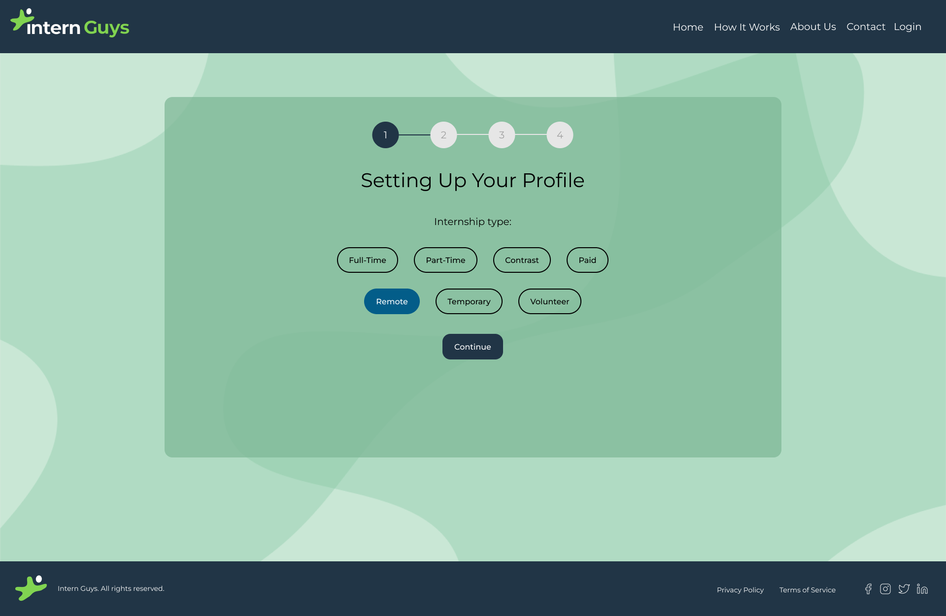
Adding a progress bar to inform users what step of the account set-up process they were at.
Creating a title for each screen to better explain to users what flow they are going through.
Designing an additional screen at the end of the flow to prevent an abrupt transition between this flow and the one after.
Attaching a modal in the background creates a better contrast between the text and the background.
Including a back button so users can retrace their steps and go back to a previous question.
Keeping the font consistent and changing it all black for better readability.
After discussing with the team, they confirmed my low-fidelity model as a good base for the redesign. Initially, there was skepticism about the modal due to doubts about contrast issues. I suggested changing the background for better readability, but the founder preferred to keep it unchanged.
Stressing the need for a modal to improve text clarity, I explained that the current white text did not meet color contrast standards. After deliberation, we agreed to implement the modal, following which I developed the high-fidelity models.
Due to time constraints, we agreed to hand off the completed high-fidelity model to developers. While the redesign did not launch at the time of my internship (it has since then), with additional time, I would have tracked the following:
During my internship at Intern Guys, I learned how important user feedback is for improving usability. Redesigning the sign-up flow and making quick, impactful changes showed me firsthand the importance of UX/UI design and teamwork in creating user-friendly experiences.