
Jan 2023 - Mar 2023
Cary Cao
Ethan Lau
Yifei Zhang
Researcher
Product Design
User Testing
Audrey’s Cafe, a Dr. Seuss-themed coffee shop in UCSD’s Geisel Library, offers student-made coffee, pastries, and snacks for students, faculty, and visitors. Our team partnered with the café to create a new website for them, where I contributed to all aspects of the design process—research, wireframing, and user testing—but primarily focused on designing and prototyping the menu and online ordering features while also leading our team’s scheduling and task delegation to meet deadlines.
After securing the partnership, I arranged a meeting with a manager at Audrey’s Cafe to gather insights on their website needs. I asked about desired features, target audience, business details, and branding preferences. To refine their vision, I also presented competitor websites like Starbucks and Philz Coffee to identify elements they wanted to incorporate.
Below are the key goals the managers set for their new website:
Geisel Library sees peak activity during exam periods, driving higher orders at Audrey’s. Increasing customer engagement outside these times would ensure more consistent sales.
Boosting walk-in traffic and implementing an online ordering system will increase sales by offering convenience to those in a rush or who prefer to skip the line.
These systems drive sales by encouraging customers to visit and order more frequently. Promoting these systems more effectively on the website can likely boost sales.
Our client identified UC San Diego students, particularly those visiting Geisel Library or seeking a quick drink on campus, as the primary audience for Audrey’s Cafe. To gather insights for the new website, our team interviewed nine regular Geisel Library visitors to understand their needs and expectations:
The menu and ordering should be immediately accessible from any page, clearly displaying item details and prices.
User interviews revealed that many were unaware of the loyalty program or often forgot about it due to reliance on a physical stamp card. Offering an online version through the website will reduce these issues and encourage more participation in the program.
Online ordering is a modern standard, allowing customers to order without lines, easily customize their options, and add items with minimal pressure.
From our research, we decided to create six key pages: a home page, about page, profile page, rewards page, menu/online order page, and sign-up page. I initially sketched the first concepts for each page, which the team used as a foundation, and later focused primarily on developing the online ordering page.
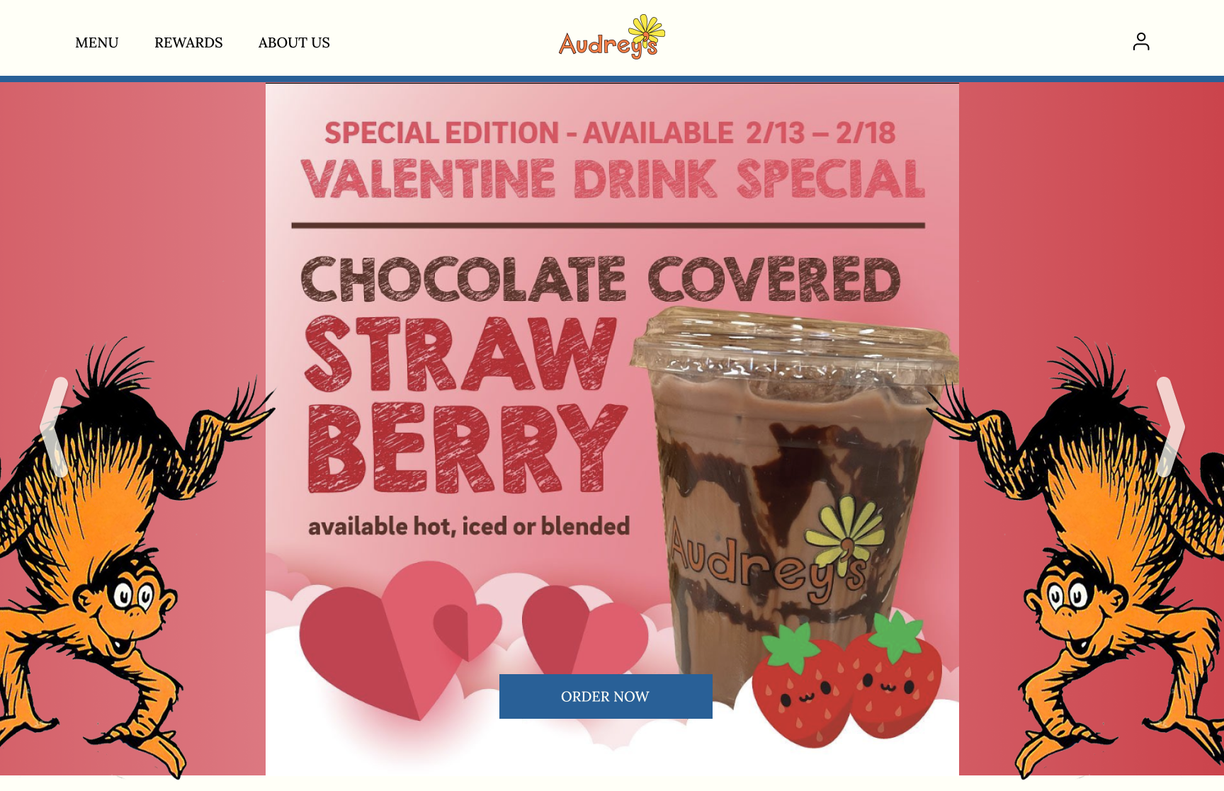
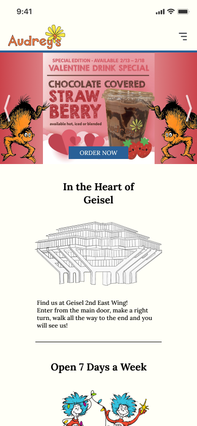
To improve the company’s branding, we aimed to give the website a fresh, playful personality by incorporating Dr. Seuss-themed characters and rhymes, using a bold color palette featuring Audrey's signature yellow, blue, and orange, and focusing on imagery over text.
I then converted my sketches into a low-fidelity model. The online ordering section consists of four pages including: item menu, item description/customization page, item checkout, and confirmation screen.
Additional user interviews and client critique on our low-fidelity menu showed us the following:
Stock images were not sparking hunger or appetite in users.
Designed a horizontal scrolling filter with shuffling categories to help users find items, but users found the shuffling confusing.
Overlooked adding back buttons on some pages, complicating navigation.
Client did not like the mostly white screens, saying they did not match Audrey’s warm and vibrant identity and felt the neutral colors missed the café’s branding.
Font was acceptable but did not portray the cafe’s branding well.
In the high-fidelity model, I addressed the issues identified during interviews and critiques:
Personally created custom images for all menu items to make the food appear more appealing. Photoshopped the images for a consistent look and used an orange background to enhance brand identity and stimulate customers' appetites.
Fixed the categories in their original order and removed the shuffling. Also darkened the unselected background for better readability.
Implemented back buttons in prototype to improve flow and ensure easy access to all pages.
Updated the backgrounds to better align with this vision and used the yellow from Audrey’s Cafe logo to brighten the website.
Incorporated more Dr. Seuss-themed elements to enhance our branding and switched to the Lora font.
After finalizing our high-fidelity model, we handed it off to Audrey’s Cafe management to decide if they wanted to use it as a base for a new website. With more time, I would have liked to look for:
Working on this project taught me how much effort and preparation goes into building an effective website. Despite meeting all our checkpoints, it often felt like we were rushing, with tight schedules for wireframes, client meetings, and user feedback. In the end, staying organized was crucial to completing everything successfully.